Search the Community
Showing results for tags 'usability'.
Found 10 results
-
 I use Enpass on a Mac. Enpass Mac lacks simple Mac user interface conventions. Here are some suggestion towards that end. 1. Use arrow keys in text fields ( with text in the field) to navigate. • ↑ should put the caret at the beginning of the field • ↓ should put the caret at the end of the last character in the field 2. ↑ & ↓ + ⇧ should select text. • ↑-⇧ should select text to the left of the caret in the field • ↓-⇧ should select text to the right of the caret field 3. Edit Menu should always have basic, Cut, Copy, Paste, Select All, etc, menu items that function when in edit mode in any field & contain standard Mac text transformation items. This is the Enpass Edit menu as it is today. General Feature Requests 1. Ability to name custom icons so they are searchable in the Enpass icon selector window, and they are so named in the Application Support > Enpass > temp folder, rather than the number sequence currently used. 2. Please launch Enpass Mini at login without having to launch the entire program. • Be able to enter the unlock password in mini w/o having to launch Enpass & have full access to all passwords (like 1Password does). 3. Have Enpass Assistant always appear under the Enpass menu icon with either of its keyboard triggers. 4. PLEASE! Make the Assistant window movable, have the ability to resize the window, & remember size & placement between reboots. 5. A pref to set which monitor Assistant is displayed on multi-display setups. As it is right now, depending on the keyboard trigger used, Assistant ether is centered on the main screen, or shows up wherever the cursor is located—even if the cursor is on an inactive display. You don't know how many times I've had to search/look to find the Assistant window, or move my cursor to the active window & hit the key combo again to have it appear next to the cursor placement. This is SO counterproductive—especially for those who want/need to use the keyboard and not have to move my hands to my trackpad or mouse. 6. Have the Assistant window appear & disappear with the same keyboard command. This way I don't have to hit the show window command, then Escape Key to close it, my hands are already on the aforementioned keys ... so why not just do and if/then? If the Assistant is showing ... hide it with the same key command ... much more intuitive & useful that way. Okay ... thanks for listening to my babble. Guess that's it for now. Hopefully some or all of these features actually come to fruition & implementation—SOON.
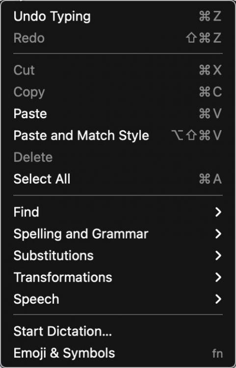
-
If I have Enpass in the Mac Menubar (Settings->General), then it works mostly nice. But If I don't want to have it in the Menubar (I don't need it sitting there, I need the space), then whenever I press the shortcut to fill in webpage date, following happens: 1. new browser tab opens 2. waiting for 5 seconds 3. need to enter master password 4. Enpass minimizes and has an extra window open which I don't want
-
I've been using Enpass on many platforms, all cloud synced, for I guess around 15 years, possibly more. Before that, I used my own homegrown solution that used several encryption schemes incuding AES, that I programmed in pascal (with Borland Delphi toolset). When Enpass came along, I was probably one of the first to jump, as I could see the advantages it had over my own solution, with virtually no penalties, other than a slight financial outlay, which looked well worth the benefits. I've always had many tens of passwords, lately, hundreds. My own solution had only a two-collumn spreadsheet-like user interface, to capture username, and password. Simples. I used it for years. But it wasn't multi-platform, and it didn't have cloud syncing, both of which are very desirable features. Mine was only a standalone secure database. I'd looked at keepass and some others around at the time and I did not like any of them, as they seemed overly complex to use, compared with Enpass which was beautifully simple to use. Hence my switch. My ideal password manager would be telepathic. I grudge every iota of thought required to think about passwords, or the management of them. The last thing I want whilst trying to carry out chores is to have to wrestle with the password manager. Unfortunately, I am finding more and more effort is required lately to keep up with the new "features", and the changes being made to Enpass. Now, to create a new password in Windows for example, I need to think about the following; 1) How best to start the app, from the windows start menu, or the windows tray? Do I already have one or the other, or even both running? Should I shut one or the other down? 2) Click the " +" add button, choose and click on the "login type" I would like to use (Who cares!), choose the "Template" I would like to use (Who cares!), this even using a search dialog, then finally start filling out the new password form, using the password generator to generate a nice secure password 3) To get the newly generated password out of the generator onto the form requiring the password, press the insecure "eyeball" button, then select the password, then use ctrl-c to copy it (because Enpass has disbled the right-click windows copy drop down menu), and then finally paste it into the pasword text field we are trying fill in the website we are trying to create the new login for. If that site is not happy with the format of the autogenerated password, rinse and repeat, adusting the format of the password generation. It should be simple, and we know that it could be, because it used to be. But now it isn't, not by a long way, and seems to get worse with every update. Enpass developers, do you realise you are destroying the utility of the utility by adding unnecessary complication? Sales are made by adding real utility. Greater utility is had by simplifying the user interface. Personally I do not want Login types, Templates, or Multiple vaults. Also I don't trust browser plugins to enter passwords in web forms on my behalf, or any execution of enpass which starts on its own, or continues running in the background after I've exited. I am again looking at Keepass now, after more than 15 years, as that solution I once turned down for being overly complex to use now seems almost favourable compared with the complex thing Enpass has become. So, rant over, on to my feature request: Please can you put a "Classic" option in the app, to be chosen at the time of installation, which will give us back the simplicity and functionality that we enjoyed up until around version 5? The time I've already spent writing this post is much grudged, so I my apologies in advance in case I do not interact further. I am way too busy to be spending time trying to get Enpass fixed. But it gave me so much pleasure to use in the past, so I think it might be worth just this one last chance, that it might improve again, before I have to accept complexity is just something we all have to live with, no matter which solution we use. Thanks, I know this is within your power. Best wishes in any case.
-
Hello, when I open an URL and want to log in, I have to click on the Enpass toolbar icon in the browser. This means long ways for the mouse pointer and also long ways for the eyes. It would be useful when you display a small overlay icon in the login fields. When I click the icon, the Enpass Assistant is shown. I know that there is a hot key to open the Assistant, but you should also offer such an icon. The browser-extension Kee for KeePass shows such an icon: Please offer also such an icon for Enpass. This increases the usability. Best regards OLLI
-
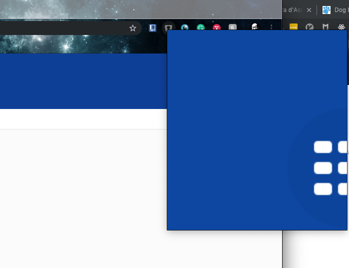
When opening the chrome extension, the view is seemingly zoomed to the point where it is unusable. Chrome version: Version 74.0.3729.108 (Official Build) (64-bit) Macos: 10.14.3 Extension version: 6.0.1 Please see attached screenshot for details.
-
Copying a password or username or any other field is one of the most frequent actions, I am doing in enpass. Currently: Right now you have to press this little icon on the right side of the field panel in order to copy or do a right click on it selecting copy or press the copy user/password shortcut with 3 keys. Suggestion: It would be great to just left click on the whole field area to copy the information and also increase the size of the copy icon, if needed anymore anyway. The show mode could be enhanced as well. Right now you have to click the small icon at the end. One problem is, that is is so small, another problem is, that I might want to show this information just for a blink second (e.g. for validation). Suggestion: Allow the secret information (all of it) to be shown, while holding a special key, when you are not in edit mode though. Other apps use the alt-key for this feature.
-
Hello, I tested Enpass for some weeks now an decided to switch from KeePass to Enpass. Also my family (wife and daughter) should use Enpass, but I want to have separate vaults for each family member (one vault for me, one vault for my daughter and one for my wife). Before I tested Enpass I tested Bitwarden. I will not use Bitwarden because my passwords are stored in the cloud (I know that I can set up my own server, but this is to complicated and too much work). In Bitwarden I can define a group and give this group a name (like "Family"). Then I add users to this group (by email address that they use in their Bitwarden account). Now I can share passwords with them. It would cool when I could add users in Bitwarden. They should be displayed on the left side (below "Tags") in a new group called "Users". To share a password I hust drag it to the user. Now a new dialog opens with the following options Share password read-only This is a switch (on and off), the default setting is "on" When this option is set, the target user can only use the password but not modify it. Hide password This is a switch (on and off), the default setting is "on" When this setting is "on" then the target user can not see the password (to prevent that they read it, go to the website of the service and change it there) This way I can easily share my Amazon account with my wife (but not the daughter), share the school account with both and keep my credit card for me. And when I change a shared password then all target users should automatically get the updated entry. This way is very comfortable and increases the usability a lot! If a password entry is shared, show a little icon at the right side of the password entry (like a little person). It should also be possible to see all shared passwords in one list. Of cause it should be possible to un-share a password that I have shared before. I just select the entry and select "Un-Share" from the menu. Best regards OLLI
-
Hi, Would it be possible to include an option that would keep last viewed item opened after Assistant is closed and then opened again? My usual workflow with Enpass (and I'm using it often each day) looks like this: Open Assistant, search for an item Click info icon to open the item Copy the login/username value Paste that value into the login box (Assistant now closes itself) Open Assistant again, search for same item again Click info icon to open the item Copy the password value Paste the value into the login box So eight steps that could be boiled down to six if only that second search + open part could be omitted.
-
Hello, when I click at an entry I see on the right side (in the details panel) all data like username, password, website, tags and many other data. I also see the two fields Last Modified Created It would be useful to see there the new field Password Modified. I know hat I can right-lick on the password and select "History". This is OK to see the history of passwords. But displaying the password modification date at the details panel increases the usability. Best regards OLLI
-
First off, Enpass has been great. This was just what I was looking for in terms of ease of use, not overwhelming with useless features, and not nickel-and-dimed through a subscription. My one feature request up to now is the ability to unmask the master password. Considering this is done in the other fields after logging in with the master password, the team must have recognized its usefulness. For the master password, I think it's possibly even more useful because a really secure master password may be extremely long. This was the only feature I miss from my days of using KeePass/KeePassX (screenshot below with sample). Anyway, keep up the great work and I'll keep spreading the word about this great set of apps!