
Cristian
-
Posts
8 -
Joined
-
Last visited
Everything posted by Cristian
-
Hello Since we now have file attachments option, it would be nice to have a tab where we could see / browse all attachments, so we can delete the ones that are too big or not necesary anymore. So overall a better file management. Thanks
-
Hello The current iOS widget automatically selects the object to be displayed, usually the last used ones. Ideally we would have an option to customize the items to be displayed in the widgets. Thanks
-
Hello The current cap limit of the password generator is 50 characters, but why stop there? Many websites support 2048 characters, or even more. You never need to learn them, Enpass would just populate them and iOS appps would only need to be setup once and then will remember the password. A perfect example is Facebook, easily 2048 character password, install the app, configure it, it never asks for the password again and web based login is easily done with fill from Enpass. Also, a new field with 'special characters' could be added in the recipe. See: http://passwordsgenerator.net/ Thanks
-
- 1
-

-
Hello Enpass looks pretty good, buy there is room for improvement when it comes to UI: - too many font size and colore. We have gray text on left column, black text main column, bold black text on title, small colored text on the right. Use less fonts changes and more consistency. - provide an option to disable the item icons and colors, like 1Password has. Too many colors can be confusing. Eithe that or use a main theme color and only use logos for known brands. - transparent tab on top, with blur just like iOS has. - more consistency with iPad and iPhone, in terms of colors. On iPad only the item title is colored, on iPhone the whole area of the title is colored. - better overall integration with main iOS design practices: https://developer.apple.com/ios/human-interface-guidelines/overview/design-principles/ As an example, please see below image, we have 5 different fonts / sizes / colors, all right next to each other, it's not a good design practice at all.
-
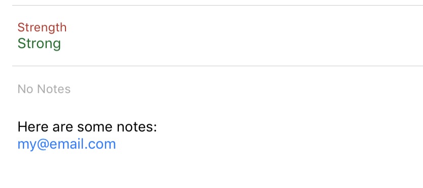
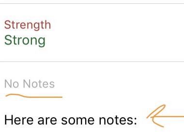
Hello On each and every detailed display of contents (the right side panel), there is a 'No notes' field, which takes up a lot of space. Most passwords do not require notes, so that entire field is just adding more clutter and takin more space. It could just be hidden / not displayed att all, unless there is a note and then then note would be displayed. Cleaner UI. Thanks After a few more tests, I realized that the title 'No notes' is always present, even when there are notes, this would need to be addressed:
-
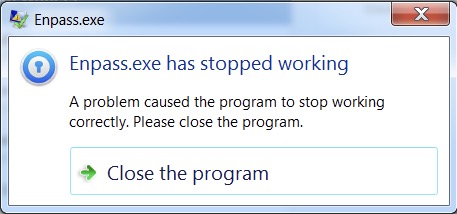
Hello The Windows / Linux versiom of Enpass crashes constantly when accessing fields with long passwords (over 1024 characters, up to 2048). There is a noticeable delay and then it crashes. On iOS there is only a 1 sec delay but it works. Enpass wouls need a better way of handling long complex paswords, so that it does not crash the PC version or slowdown all versions. Definately a bug / request to look into. For testing purposes, add a 2048 password with all characters and numbers and special characters, save it and see the delay on iOS and the slowdown and error on PC when trying to select that object.
-
Hello It would be great to have support for other iOS browsers as well in: Settings\Browser\Open Links In We could add iCab, Dolphin, Chrome and Firefox. Thanks
-
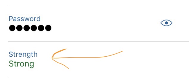
Hello When viewing the contents of a category, let's say a website which has a login user and password field, there is also a whole line below the password which suggests the password strenghts (weak, good, etc). However, that is being displayed all the time and takes a lot of space. I understand it to be present in Edit mode, when we add the password, but it would be great to not have it displayed all the time or maybe a switch to turn it off or on. This only appears for Password field type, for text, numeric, etc it does not appear. Having a marker like this makes sense, but only in Edit mode, there is no need to have it there all the time, maybe only have it appear when the password is weak, but when it's strong it could go away / hide. Thanks
-
- 1
-