.jpg.eb0a26643874b7671fc0bebb4230f659.jpg)
gpf
-
Posts
10 -
Joined
-
Last visited
-
Days Won
3
gpf's Achievements
")
Newbie (1/14)
7
Reputation
-
.thumb.jpg.112a5cae378f610dd4d4c892f9c1daba.jpg)
Windows Hello doesn't work on system boot, must restart Enpass
gpf replied to PGTipz's topic in Windows 10 (Store)
Thanks for the suggestion, I'll try that out. Is the layout and functionality the same in that version? -
Windows Hello doesn't work on system boot, must restart Enpass
gpf replied to PGTipz's topic in Windows 10 (Store)
My installation is similar. Unlocking the app using Windows Hello at the beginning of a Windows session works fine, but after locking and unlocking the screen, or after many hours, I am unable to make the Windows Hello authentication run. This appears but nothing for me to click to start Windows Hello! You need to add a button that starts a Windows Hello login session, or else offer us an alternative login method on this screen. Even clicking this "Open Enpass" in the system notification icon makes no difference. The app window above appears when I click this, but again, there's no Windows Hello interaction: Version I'm running: The only way I can login is to Quit the app in the system notification tray and start again. It's very frustrating!
-
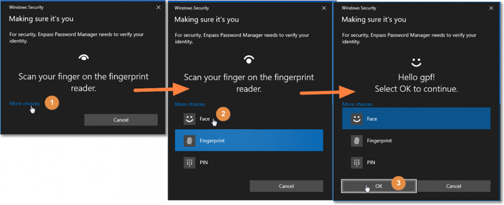
I am enjoying the addition of Windows Hello security but it always defaults to the Fingerprint unlock, meaning to use Face Unlock I have to use the mouse to click 3 times: More Choices Face Ok How can I set the default unlock mechanism to Face instead of Fingerprint? I just tried removing the assigned Fingerprint and that DOES work - now it uses the camera to Face unlock first, but I shouldn't have to remove the Fingerprint option. Ideally it should remember the last unlock choice and reuse that the next time. Thanks
-
gpf changed their profile photo
-
I love dark themes, don't get me wrong, but the background is pure-black which makes the contrast between that and the light colour text extremely hard to view for too long. Read what the experts say about dark mode: 8 Tips for Dark Theme Design. Dark theme is one of the most requested… | by Nick Babich | UX Planet (uxplanet.org) 8 Tips for Perfect Dark Theme UI. Is Dark Mode just another trend or… | by Dorjan Vulaj | Prototypr How to design delightful dark themes | by Teresa Man | Superhuman The Ultimate Guide on Designing a Dark Theme for your Android app. | by Chethan KVS | Prototypr Could you add a dark gray option for your users to choose between that and pure-black? I note that when the popup menu appears the background goes from pure-black to dark-gray and it looks GREAT, but it only changes while the menu is on top: Dark Theme: When popup menu appears on right side it becomes dark gray: Thanks Gary
- 1 reply
-
- 1
-

-
+1
-
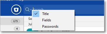
Is there a way to search across all three fields, so we don't have to change between Title, Fields and Password when looking for something? It's time consuming and fiddly on my smart phone and the worst thing is, you can't tell which area it's in (the icon is the same - make it different?), so you have to tap or click the search icon to see what area it's searching. The system needs to include an "All" option in case the user doesn't know whether the search criteria is in the Title or Fields. The Password field is a bit different, but it would definitely be good to search across Title and Fields at the same time without having to manually change.
-
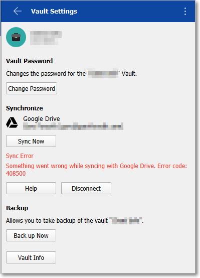
I'm getting this today. How do I fix it? I've disconnected from the GoogleDrive account and reconnected fine. But the error persists.
-
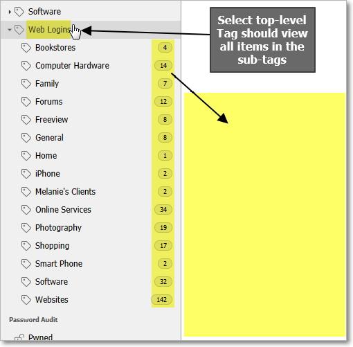
It seems logical that when I click on a top-level tag, the items of all sub-tags should display in the item list. Without this, I need to click each sub-tag to view the items within. At times it would be great to view all sub-tag items in one list when a top-level tag is selected.
-
I have recently migrated 703 items from Datavault to enPass and although I am enjoying the enPass experience, I badly miss the ability to group things in sub-categories. I have had to reconstruct my collection into Tags and sub-tags, which is ok, but sub-categories would be cleaner. Will you consider adding sub-categories as an option? Thank you Gary
-
I am a new user and agree with @SweatyCheek about the size and font-weight of the Category and Tag icons. Their grey-on-grey colour is very hard to read. I used your old portable version 5.6.10 to transfer my information from Datavault (why would you remove this migration tool from your latest version I wonder?). The font color in the old 5.6.10 version is clear and easy to read, but you've made it hard to read in the latest version, see my attachment for comparison. Can you add some display options for people to choose darker text colours? It is really hard on the eyes after a while. Also you don't need so much spacing between the lines. This means the user has to scroll further to find records. Look on the comparison image how much more space the new version uses compared to the old version.