Leaderboard


Popular Content
Showing content with the highest reputation on 02/02/19 in all areas
-
When needing to login in an iOS app, i choose « password », it opens Enpass, then I choose the correct record in Enpass. Expexted result : it should fill in the login and password. Current result : nothing is filled in. The login and password stay empty. Thanks for solving this.1 point
-
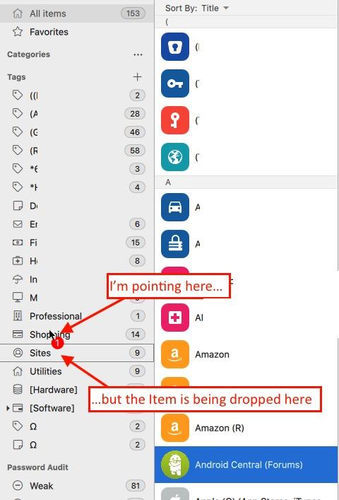
Hi Vikram, While the nested tags are an improvement... a) they're not user-friendly (users have to learn the use-a-colon trick from somewhere) b) the bigger issue (to me anyway, but I get the impression it's big for everyone) is that when adding tags to an Item, there's no auto-complete As I've mentioned previously, if you have a tag called "Utilities" you have to type the whole thing every time. And because you can't scroll through the sidebar (categories, tags, etc.) when in edit mode, it's impossible to see the names of your exiting tags while trying to type them in. So it's really easy to accidentally end up with multiple tags that were meant to be the same thing: "Utilities" and "Utility" (because you didn't remember your original tag was plural, not singular) and "Utlities"(because you made a typo). This is only compounded by the nested tags "improvement": Did I call that nested tag "Utilities:Power" or "Utilities:Electric"? Without being able to scroll the sidebar — and more importantly, without auto-complete options — the only thing one can do is save the Item, then drag it to the correct tag in the sidebar, which is an extra step that shouldn't be necessary. On top of that, there are two more problems that compound the issue: 1) It's not possible to drag any item that isn't active (highlighted in blue), so there's an extra click involved (not a big deal, but I know this isn't normal behavior because I've never had this problem in any other app) 2) When you do drag the Item to the sidebar, it's not being put in the Tag that you're pointing to with your cursor, but rather the one below it: Of these problems — all of which need fixing, and most of which I feel shouldn't have made it out of beta — in my view the auto-complete is the most important (and unfortunately probably the most work for your team). If I'm adding a tag and type "Uti" and Enpass offers the auto-complete option "Utilities" because that tag already exists — that's saves a lot of hassle. But as I say, all of these are important, and many of them are due to the fact that the UI has been redesigned to work across a bunch of platforms, instead of having a Mac-like app for the Mac, an Android-like app for Android, etc. In Enpass 5 (for Mac anyway), editing an Item took place in a child window, and it was possible to scroll the sidebar in the parent window behind it. But in the new design, opening Edit makes it impossible to do anything else in the app. It's not even possible to open the preferences when in Edit mode. Having been part of UI/UX teams, I definitely understand the instinct to try to make one UI that works everywhere. It's a tremendous time-saver and makes both the design and QA processes much easier. But when it makes the app user-unfriendly, you end up shooting yourself in the foot. I'm a big proponent of Enpass, which is why I'm so active in these forums, and why you'll see me both criticizing and defending. But I don't recommend Enpass to anyone else at this point because compound issues like this make it difficult to use — and I run into issues like this every day.
 1 point
 -
@Vikram Dabas no need to continue improving the app, there's something more urgent to do: a export feature or utility that allows users to move out of enpass the same way you allow them to move in (csv export with folder/tags structure information), that's all! seriously I will would pay you directly for that1 point
-
Mr Monyker, how do you think so many people got migrated to Enpass 6. The extension of Google chrome stopped working and said needs to be upgraded. If you are so wise then tell me how & where to download Enpass 5 for which I had paid Lifetime Licence Fee ???1 point
-
Uhh, no they did not. And see what other apps do when they can't honor their old license. This is not something new and many apps have done this.
 1 point
 -
Nope. I'm a satisfied user. I also understand that it takes effort and resources to deliver, improve, secure and support software/services. Uhh...they named it Enpass 6 ;-) Some responses here sound very entitled and tantrum-like. If you can't stomach a very reasonable charge for major re-write upgrades, you might instead consider some other well-known subscription password management services. That way you'll know exactly what you pay for the year/month, assuming the subscription costs don't change, of course. You might also consider one of several free password managers. When you're ready to come running back, Enpass will still be here. :-)1 point
-
Do you work for Enpass ? No one told us either that we need to pay again if we upgrade. If it's a different app as what they are claiming it to be, why offer it as an upgrade? They should have just named it a differently like Enpass 2. I've seen apps in the App Store do this.1 point
-
Same here. I am about fed up with all the promises with app purchases. If it says Lifetime License, then it should be, and should also apply to updates. I love Enpass but this is ridiculous!1 point
-
sorry Hemat Kumar but I tend to agree with charly1310 on this one. I purchased the UWP version to use on my tablet for the sole reason that bridged apps tend to be glitchy when windows 10 is in tablet mode. The browser integration was not a big deal to me, after 35 years on a computer I have become quite proficient with copy and paste. I reset my tablet today, an issue unrelated to your software, only to find that I cannot even download the UWP version that I paid for because it has been disabled for windows 10 desktop. I was happy with the 5.x.x.x version and didn't need nor want to upgrade. I'm not disputing that a new license is required for added version 6 features, you have to monetize your software in order to stay profitable, but I do dispute with you the fact that I cannot download a version I bought and paid for even if upgrades for it are disabled. I have purchased the blackberry , android, ios, and UWP versions of your software but now I feel as though people that have supported you are not a priority since we cannot download the software we paid for.1 point
-
Sorry, but this is utter BS. Blaming Microsoft for being "limited by technology and restrictions" is a pretty bad excuse for screwing over your valued customers, who have paid for the now worthless lifetime license. YOU chose to create a new product, not Microsoft. You could have easily kept the app on the UWP platform and update 5.x to 6.x without making your customers pay again. But no, YOU chose to create version 6.0 with a different underlying platform, so of course it's considered a new/different product. Regardless, you could have worked out something to let users upgrade for free, but again YOU chose this path deliberately in order to create a new stream of revenue. I'd be totally fine paying for an upgrade hadn't you advertised and sold the previous version with a "lifetime license". The current situation is simply NOT ACCEPTABLE and should be considered SCAM.1 point
-
I agree that lifetime language may be unhelpful, but I don't think anyone was forced to upgrade to Enpass 6 (no one was holding a gun to your head, correct?). You were free to stick it out with Enpass 5 and the technical and security problems that would entail when it is sunsetted.0 points


