Search the Community
Showing results for tags 'ui'.
-
I have previously used Bitwarden and 1Password, and now I’m planning to switch to Enpass. After using it for a while, I found that there are no functional shortcomings, but the interface of Enpass is not very aesthetically pleasing. It lacks shadows, rounded corners, and has a strong Windows-style UI. I hope it can be improved in the future.
-
I'm just sorting through my items, categories and tags and noticed that the currently assigned category is not visible when having an item selected in the application. It would be great to have the category visible when showing the details of an item.
-
Dear Developers, Enpass is one of the good password manager but in windows 10 the icon of the app look like outdated and also need some improvements the main issue already mentioned but still not solved by developers. In light mode app icon is not properly shown already ask before 5 to 6 months but still same issue. check both the image and solve the issue of the app.
- 1 reply
-
- bug report
- ui
-
(and 1 more)
Tagged with:
-
Sometimes, especially when using an external monitor attached to my laptop, the Chrome extension (used in Vivaldi in my case) displays its contents at the wrong scale. The Safari extension does the same thing. This is both the locked and unlocked screen. It doesn't respond to clicks in the expected way, but I can still use it if I stick to the keyboard. Just checked and the menu bar app does the same thing too. However the desktop app looks fine. Mac OS Mojave, latest Vivaldi, Safari, Enpass.
-

whatsapp Customer Support on Whatsapp or Telegram
Dinesh Sitapara posted a topic in Feature requests
Dear Developer, I'm an Pro user of enpass since 2017 and the app is great. Recently I seen so many reviews on web, youtube and elsewhere.. most of the reviews says so many cons of enpass like customer support.. I request you to take feed back via whatsapp or telegram group and connect with customers via whatsapp or telegram so you can find better solution.. every users can not use emails of forum.. your whole feedback and discussion available on forum only.. but whatsapp or telegram used by everyone so try to reach via whatsapp or telegram so no one miss the update and every release gives details via telegram channel or group.. every big Companies use more social platforms so that they can reach with more users...as a professional student I know the value of marketing and business expansion.. so try to go via telegram and whatsapp so users can send u feedback very fast and effectively.. so more and more users gain your info and gives very positive path to your business. Hope u considered my feedback as a valuable and take reasonable steps as soon as possible..- 10 replies
-
- new feature suggestion
- beta
-
(and 8 more)
Tagged with:
-
-
Hi Enpass Team, Thank you for developing Enpass. I am on the process of switching from a long-time 1Password user to Enpass and have to admit I like it so much more than the others I have tried out. After trying out a while, I would suggest to improve a bit regarding Enpass's UI. Instead of waiting for the user to click 'Unlock', Enpass can automatically unlock if the entered PIN/master password is correct, otherwise, issue a vibration or sound to inform the user to retry. That would save one step and make the interaction flow smoother. It's actually the behavior of 1Password and I have found that it's truly convenient for users. Just my 2c hoping to improve Enpass. Cheers, Alex
-
Copying a password or username or any other field is one of the most frequent actions, I am doing in enpass. Currently: Right now you have to press this little icon on the right side of the field panel in order to copy or do a right click on it selecting copy or press the copy user/password shortcut with 3 keys. Suggestion: It would be great to just left click on the whole field area to copy the information and also increase the size of the copy icon, if needed anymore anyway. The show mode could be enhanced as well. Right now you have to click the small icon at the end. One problem is, that is is so small, another problem is, that I might want to show this information just for a blink second (e.g. for validation). Suggestion: Allow the secret information (all of it) to be shown, while holding a special key, when you are not in edit mode though. Other apps use the alt-key for this feature.
-
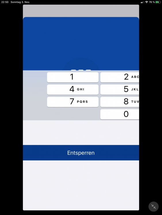
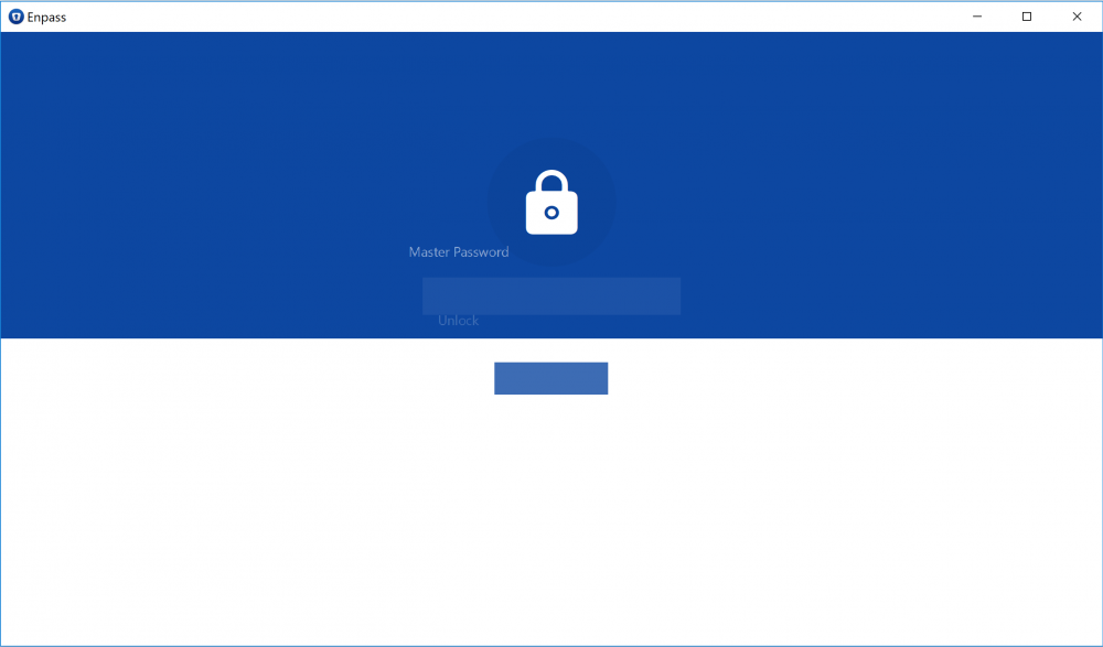
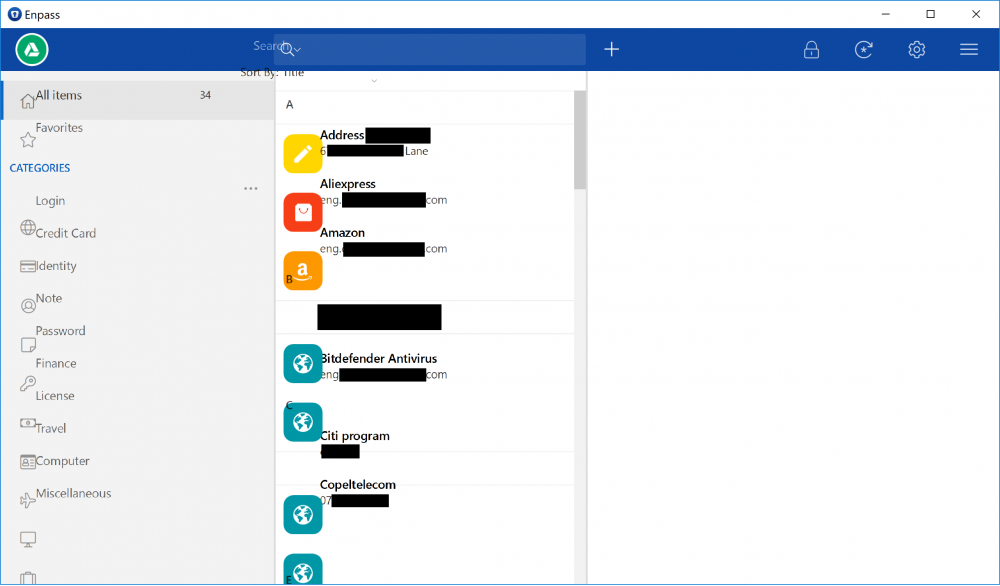
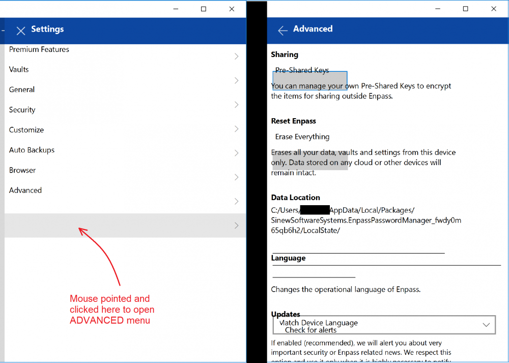
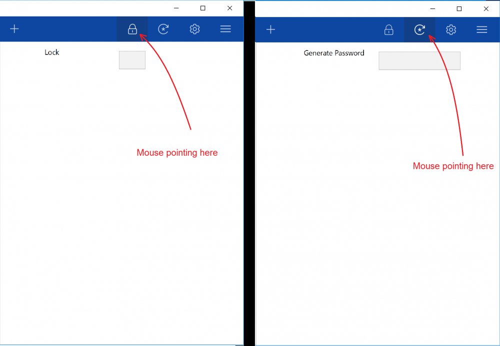
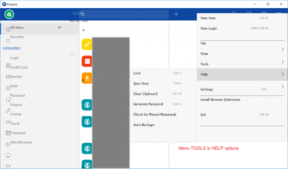
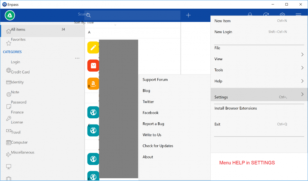
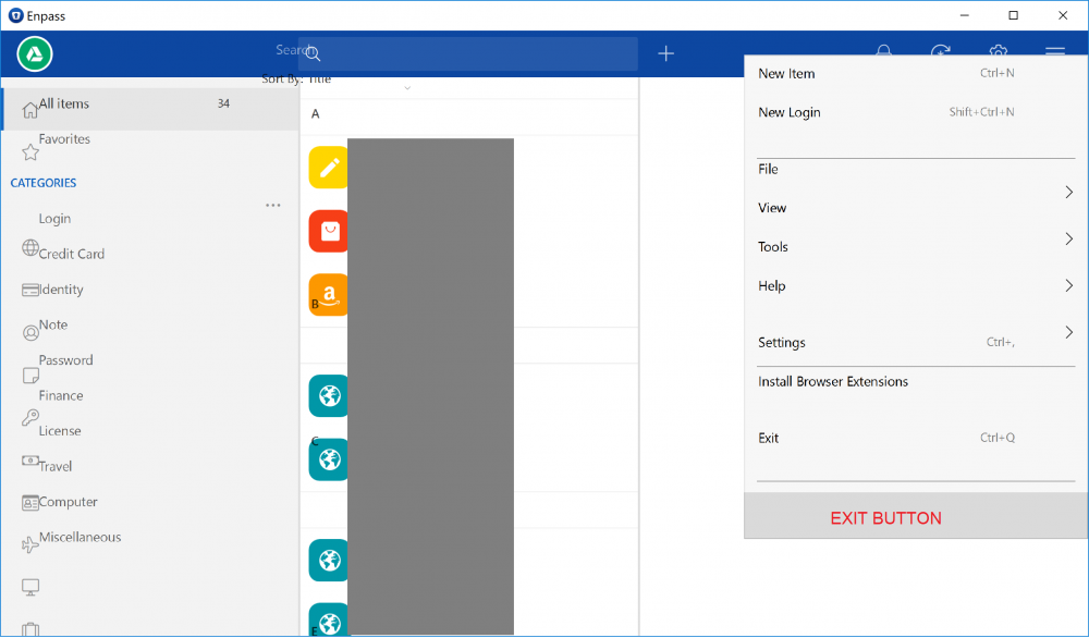
I use Windows 10 and my computer resolution is 4K UHD. I never had this resolution before and, at the beginning, I was facing some problems using some old software that I have. Usually you just need to right-click the shortcut and change in the properties some option to make Windows work properly with the software. Usually the error is just that the user interface in this softwares will be shown in very small size, small text, etc - because of the "standard" resolution that the old software have. Now, my problem is that the items are being shown in wrong places. Text are in horrible resolution, and it is being very very hard to use Enpass. I tried to find the exe file to change the way that Windows show the software, but since it is not a "C:/program files" software it is not possible. I've uploaded some images showing the problem, that is more related to wrong places that the text and icons are, and in the menus usually the mouse have to point to a different place to have access to the right menu. The submenus have the same weird behavior of showing icons and text in different places. Thank you!
-
Dear Developer, Enpass IO is very good app, but some best features still missing like in recent beta i shown that you change logo, every app have unique logo for apps. like see Deshlane logo is super over all internal UI not much more attractive as compare to other apps. because every apps design make more difference with other competitors. i am not says negative about apps but if you change your overall design like give controls on bottom instead of upper than more convent for one hand and more clear. you have to implement lite white design like all google apps and you have to change your app logo.. design of every app more important. also some major feature missing .. i already send mail but still no reply by developer team, in every business customer after sales service so reply to every member is more important, i am just sending some suggestions.. thank you for this beautiful app, very convenient superb work.. recently in started to add my clients login details in this app.. so i hope you understand your position in current market.. truly indian app.. superb work.... thanks in advance. Dinesh Sitapara
-
Hi, I have 100+ entries on Android and all the time the entries have not been aligned with the capital letter for each section. And if you have many entries all starting with a unique letter then they are all wrong in the GUI. Not a big problem but starts to annoy me as there have been many updates not fixing this. For example all my entries starting with B is shown by the capital 'B' to the left of my first 'B'-entry. However, the capital B is written next to the second 'B'-entry and not the first one leaving the first 'B'-entry as the last one in the 'A'-section. This applies to all alphabetic sections except for A which is the first one. A A1 A2 B1 B B2 (<- the 'B' should be next to 'B1' and not 'B2') Thanks for a great app otherwise. Ole
-
Enpass should not require the user to manually click on "Save" button when editing an item to save the changes. Sometimes after I've made an edit, I do something else for a while and then Enpass quickly locks itself. After unlocking Enpass I might just accidentally click on "close" on the item currently being edited and thus lose my edits. Enpass should really auto-save the item with a certain time interval, or at least maintain a reversible history. It's great to have a password history (after you actually saved the password, apparently), but if I edited something but somehow didn't manually save it, I'd be in huge troubles. This happened to me several times already. Now I'm in a situation where I have to go through the account recovery procedure at a cryptocurrency exchange since I didn't actually save my OTOP secret, and a bug in Google Authenticator (https://github.com/google/google-authenticator-android/issues/51) just made matters unsalvageable... which is not great at all.
-
Hopefully a simple request... on desktop (Mac in my case... maybe others are different) when a user clicks on a copy-to-clipboard button in the interface, there should be some type of animation or user feedback to indicate that the copy-to-clipboard happened. (I suggest an immediate background highlight (perhaps blue) that fades over about 1 second back to transparent.) As it is now, there is a highlight on the button only while the mouse is held down. If you just click on the button, 99% of the time it's so fast that you don't see any highlight / feedback at all. If the window isn't the frontmost window (maybe it's off to the side), the first click on the button (or anywhere) actually doesn't do anything, it just brings the window to the front. That combined with the occasional user error (missed clicking the button... off to the side or something) combines to make a somewhat frustrating experience. In essence, there's no feedback as to whether something was copied or not... until you go to paste and submit and... whoops! that wasn't the right password, or whoops! instead of pasting in that piece of data you just pasted in 5 paragraphs of text that you copied earlier. Out of necessity in real-world use I have developed the habit of clicking the copy button a jillion times like a rabbit in heat "just to be sure" that what I want copied is actually getting into the clipboard... and I find it frustrating and annoying every time. And ... speaking of first click just bringing the window to the front... maybe, if possible, it would be good to allow click-through for those buttons so that you don't have to bring the window to the front first just to copy something to the clipboard. I know I would love that.
-
Hello, Just started to use the Edge extension and its working well, but I think the UI needs to be tweaked. I have the Dark Theme enabled for Microsoft Edge browser and I noticed the Icon is very hard to see, it looks very dimmed out. Now at first I think that this is suppose to be by design and when you get to a page it recognizes it would turn bright white and stand out, but during testing I signed out of my google account and even though it found the google login the icon did not change. 1.) I don't know if its possible for the icon to change color, but it would be nice to keep it dim on pages its not being used, and light up when it can submit a password for you. I do know that the "Pocket" extension changes to Red when you click add to pocket. 2.) If #1 isn't possible I hope the extension can support the Microsoft Edge dark theme so the icons is visible. I did check the options of the extension and there is no where to enable dark theme.
-
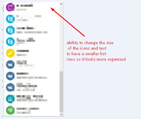
First I'd like to say that I am in love with your product, the functionality is great. Here is my suggestion: It would be nice if users had the ability to have the main view smaller sort of like a small 'list view' so it looks more organized, I think users would love to have that ability.because we'd be able to see more in less space. Thanks for making this great software.
-
All- I use Win 8.1. My Taskbar is placed at the Top. When activating, in the lastest 2017 06 22 Enpass, the "Settings" window, overwhelms the top of the Desktop. It cannot be resized to make it manageable NOR to see the lower left "Save" button. Please debug to allow proper "Settings" Window resize + move-ability. --- Qalisto -------------------------------


